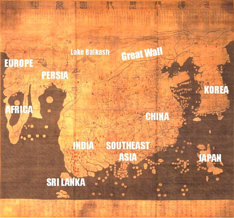
 One of the most noteworthy world maps from the period immediately preceding the European discovery of the Americas comes from Korea. Titled Map of Integrated Regions and Terrains and of Historical Countries and Capitals, but known more popularly as the Kangnido, the map was produced in 1402, early in the era of the Yi Dynasty (1392-1910), an age of vigorous cultural renewal for Korea. The cartographers who created this masterpiece borrowed freely from Chinese, Islamic, and Japanese maps to fashion an integrated map that included almost every known area of the world. Once one has become accustomed to the map's eccentricities, the modern viewer is astounded by its perceived appearance of truth. To be sure, Japan is located directly south of Korea and farther away than it actually is. This might well represent a statement of supremacy over an age-old enemy by the Yi court. Also the image of Europe leaves much to be desired, but the fact remains, Europe is on the map!
The Kangnido was copied many times, so prominent was it to the Yi self-image and program of reform and regeneration. Although the original map is now lost, later fifteenth-century copies are in existence. The map that appears at the top dates from around 1470. You can click here for a larger view of the map. Additionally, you can also click here for the same map that has been labeled by scholars, and you can click here for a more detailed breakdown of Europe. After you have studied the maps a bit, I would like you all to think about and discuss the following: What does the relative size of Korea on the map suggest? Where does the center of the map lie? What does that suggest to you? What have the mapmakers done with China, India, and mainland Southeast Asia? What do you infer from this? Locate the Arabian Peninsula and Africa. What strikes you as particularly significant about these two features? In answering this question address their relative sizes and also the shape of Africa. Finally, locate Europe. Which areas are most recognizable? Which are most vague? What do your answers to these two questions suggest about the sources the Korean cartographers used for the Far West? Your thoughts...



55 comments:
From what I can tell from this map and the scholar labeled map, the Korean people were very detailed about what they knew. Korea on the map is significantly larger than it is in real life, showing that they paid special attention to their own region, and perhaps thought that they were one of the largest land masses in the world. Another thing that one can assume by looking at the map is that their ties with western countries was minimal or nonexistant shown by how much larger the Eastern part of the world is compared to the Western world. You can also tell that nothing is known about the southern hemisphere because Australia is absent from the map as well as the Americas, and other Southern landmasses. Another thing I noticed was Antartica was missing, and it makes me wonder if anyone has discovered Antartica in the time period these maps were drawn.
They made china and india way to big for the map in proportion to korea and europe. china is a big role in the world but it doesn't need to be the center of the map.
first off, before i read the document
i looked at the picture to try and figure out what in the heck it was..(i thought it was one of those amatuer paintings done by one of those Chinese government beurocrat guys)
what i noticed from the map right away was that Australia isn't on the map at all, along with the Americas or Antarctica.
Also that India looks bloated,
and Africa looks like an oval donut.
Although Japan seems the most proportionate.
To me it looks like Korea thought they were much bigger than they actually are. Also China was the center of the map instead of Korea, this could be because of the Chinese influence on Korea and the Chinese being such a threat to korea.
I am able to sort of recognize Japan, but it isn't in the right place. i can also see China , but the size i believe is unporportionate probably because China thought highly of themselves and also the map depicts China located near the center of the world.
Why is there a big water mass in the middle of Africa? or could that be the Sahara Desert or somthing?
Looking at these maps i can see that the sources for the koreans were people in Asia or people with whom they traded often. Everything looks like it surrounds china. The koreans portray themselves and china and india in a larger view than they truly are. it shows that the tiny africa and europe are not to be known well by the koreans. Didn't they have the best trade with the arabs, then why are the arabs placed as much smaller than the othrs?
This is a very sinicized map, which is understandable because of China's inluence on Korea. Korea is oversized, for the map is Korean. China is very large and is in the dead center. I could not find India at first. It looked like a part of China, and was very large due to the trading ties with the rest of the Asian world. On the left side of the map, Europe and Africa are barely recognizable; Europe looks like those foot binding pictures we saw...
At first I could not find Africa, I thought it was where the Arabian peninsula is. And I thought that the body of water in Africa was the Mediterranean. Persia is way small. Perhaps the "body of water" in Africa was due to the fact that no one went into the center of Africa due to harsh conditions, and they may have thought it was a sea. Italy retains some of its "boot" shape. Spain is recognizable once you know where Europe is. Because Europe was far away their sources were probably less accurate and fewer than those of Asia.
All I really nedd to say is remember all the maps from the first day of school? THEY WERE A LOT LIKE THIS MAP. This map was Korea's view of the world. From this map you can tell how much of a relationship the Korean people have with Europe and Africa (not very great they don't have a clue about the land). And what they think of China and South East Asia (they made them quit large showing how they are in contact with these places). Also Korea is quit large on this map (showing what they feel of their country). It is a great example of prespective of Korean people of this time.
From what I can infer from the map is that Korea thought that they were one of the largest areas in the world. They also make land masses around them a lot larger than what they really are, showing that they didn't care or know much about areas far away from them. The Korean people are very detailed because the map is very detailed. I found it interesting how small they made Africa and Europe.
they seemed to have made the india region like hugeee while africa is like baby small..
so im thinking that it was either because they wanted to put more detail into their own region like most people do. its kinda relating back to your center point for earth is where your from. or it could be that they didnt have great sources relating to all of africa so they all just persumed it was that small with the little knowledge..
Korea is significantly larger on this map, this may be because they were the map makers and feel their region is larger or more "superior" to the other surrounding regions. Europe seems to be just mumble jumbled together to me which may come from the lack of direct interaction between the two regions. And Asia is in the center, which emphasises on it.
It looks like someone started drawing the map at the left, and ran out of room as they went right. China is huge and centered, due to the fact Korea was a tributary state. They were showing they thought China was better. Hardly anything in Europe is recognizable.
This map reminds me of the maps we made the first day of school. Like how we made the USA the largest thing and everything was way small or not even there in some cases. China and Korea definitely saw themselves as the center of the universe...which obviously isn't true. A lot of countries thought that though back then, but it was cool of them to actually recognize Europe and Africa on the map...even though they were way off in size.
wow, that reminds me of the map I drew at the beginning of the year! Well first there lack of perception or maybe just lack of interest in certain areas led to a distortion to a certain degree of this map. Great point mentioning that Japan was put way more southern than it ought to be because them and Korea were enemies. That shows somewhat of a bias. Also I can't really seem to find India if its what i think it is on the map than it is extremely out of proportion. But overall, for the technology that was available during this time period this map is a huge adavancement and shows the progress of the world at this time.
to me it looks like on the scholar map the people just made tghings bigger that were higher in population or high in production...
or maybe even of what was best well know to that person
i think it looks like you gave a 1st grader a pencil and paper, and told him to draw picture... The Korean map looks rather detailed and the map labeled by scholars is more general, and it think that shows what you were talking about in class, how they dumbed down the test so more people passes, and so this is what you get, instead of well thought out work.
Whoaa. Okay, so i didn't even know that the picture right there was a map until i clicked the first link and it popped up again. I guess the map has changed a lot over the years since they first made it.
Okay, so first of all the way the scholars labeled the map doesn't seem to look right to me. Korea looks freakin' huge! and so does India. south east Asia kinda looks more shifted to the left and it looks like its only in that area when i know south east Asia also includes the Philippines and islands, but it doesn't look like it's even there. The center of the map is China. Which, to me is not right. Most likely, Chinese scholars made this map and they emphasized on China because it was where they lived and came from. It's kinda like the same thing as what the Europeans did. They put Europe in the middle of their map as well. Africa looks TINY! OMG; i would have never thought that was suppose to be Africa unless i saw the labels. I think this map is a messed up map to me in my opinion. && why is the Great Wall the only man made freature on the map. It's big I know, but they didn't even put any major river systems, physical landscape (except for Lake Balkash) or anything. Japan also looks funny to me. && Where are the Americas??!?! Do we not exist or something?
well miss dang the map is from 1402. therefore this is no knowledge of the americas in the old world web. YET! stay tuned for a very... ahem... apocolyptic season 3!
From these maps you can tell that China is def. the center. I wonder how the koreans would have drawn this map if they didn't have that tributary relationship with China.
since south korea had a tributary relationship with china, they made china the center of the map as well as making it look bigger than it was, along with korea. they made india and africa look smaller because they barely had relationships with those two parts of the world and europe's size was smaller too in my point of view. korea also didn't have that big a relationship with japan since it was geographically separated by water masses, therefore, they did not distort the size.
i can see from this map that china is placed dead center, even though it was created by the koreans. this shows how even though korea wanted to stay independent they were forced to recognize the chia was the superior, and they did so in many ways.
Yeah i can see the way that Korea reacted towards the way that china made them give tribute.
To me this map looks like how Europeans made their maps but instead of just having China in the middle of the map they also made it the largest probably to emphasize the importance of it. What I thought was odd was the fact the it was a Korean map, so wouldn't it be logical to have Korea be the center? Its not like they liked the Chinese all that much so I think it was stupid to make China feel special and put it in the center.
Africa looked like the most obscure. Why is there a big hole in the middle? What I was thinking was that it is to represent the sea trade that they had but i doubt that is it.
HAHA Europe finally got put in its place on the map :]
Whoa! Everything is like, connected!Where's the rest of the Indian Ocean? I coudln't even tell what was what before looking at the more detailed map. Korea is awfully fat. They didn't see to pay much attention to coast line either, which is understandable. It would be probably be easier to get most of those place by land with such an open ocean. They also made Africa very small, which shows they probably haven't been there by this time.
Well its obvious the Koreans saw themselves as better than many other nations except for China to whom they were a vassal state. Maybe it wasn't all arrogance though maybe it was just common knowledge of the area around them and what was important to them like how ealier this year Mr. Prill made us draw our own world map. Many of us probably drew the U.S bigger than it should be and completely forgot either India, Indonesia, or the Arabian peninsula. Tjis is kind of the same thing they draw Korea large because they know it well, but Europe to them is foriegn and distant so it makes sense they do not draw it to scale or shape.
Korea is significantly larger on the map, which makes sense to them. it makes sense to me since a ton of maps of the us make the us the center of attention. i am kinda wondering if they new about australia and antarctica. was it not shown because of size reasons or because they didn't know about it?
no knowledge of those areas yet miss green.
I think that it is interesting that this map is drawn this way. They put Europe on the edge of the map and it was extremly small. Also i found it strange that there was a lake in the middle of Africa. That's just strange. But on top of it China was the largest then Korea was the second lagest even though Korea isn't that large.
Obviously, since Koreans were the makers of this map, they made Korea bigger than its original size. It is similar to how America is in the center for the world map in a map made by an American company. China is in the center of this map because of sinification. It shows how China influnced much of Korea during this time period. Also, we can infer from the map that the mapmakers did not have much knowledge of Europe because most of it is smaller than its original size and most of it is incorrect. I think Africa and Arabian Penninsula, however, is more correctr than Europe because its shapes are correct.
they added a huge ocean in the middle of africa? they didnt seem to know much of the world besides korea and china. China was obviously larger than normal because they had to please the chinese emperors because of their relationship
hmm... what did we say the african viewed the sahara desert as? ah yes, an ocean. hopefully that explains the appearance of africa on the map.
Well, the map definitely has China at the center, meaning Japan thought China was at the center of the world and the world leader of it all. It also has Korea being abnormally big. That probably means that Japan thought Korea was was more important and more powerful than Japan. They had a very skewed view of the world. Although, being somewhat owned by China, I can kind of see why they had it at the center.
Wow, from this one map, you could definitely tell that China has alot of power over Korea. It really made me think that China was a really powerful country. And amazing how that power could just change another country's way of thinking in drastic ways.
But, still, like the Europeans, China was in the dead center, hah, & Korea was bigger than it really is.
Korea seems to think of themselves highly which makes sense, since everyone likes to think of there country as superior or the best place to live. China, being in the center shows that China has a huge influence on them. It also shows that the Koreans thought of China as there leader in a sense. Africa has a huge whole in it. This could show the areas that are kind of difficult to navigate. Most of Africa is made of Desert and Tropical forests which makes travel difficult. Most don't know whats there.
Since Korea is off to the side and pretty small ,considering how big China is, it seems like a Chinese person would have made the map. Think these Koreans were not only influended heavily by the Chinese, they were scared. We all know that Korea paid China for them not to attack, maybe this was also another way of recognition that China was superior. Also, alot of the places to the west of China are really jacked up. Im sure that the sahara desert was taken as a literal ocean. Europe is also on the map but it doesnt seem like it makes a major impact because of its size. This is kind of like that map we had do draw in the beginning of the year to show what our world view was like.
Dante' Johnson
China may be a "tad" overscaled there... The koreans obviously placed China in the center because of their relationship and in their personal views, China was the most important region around.
Obvously they made Korea bigger because they think that they're the center. Every other state to create its own map has done the same exact thing, make it bigger and put it in the middle. Europe created our current map. It's all a pattern.
China seems to be huge on the map because of the influence it had on Korea and the fact that they thought they were 'they best'. Its funny that they put themselves also bigger on the map. Africa and Persia are oddly shaped as well. This to me shows the little they knew about that part of the world.
on the map china's size is extremly exagerated and it is also on the center. koreas size is also bigger
Korea is huge, China is in the center, Africa looks like it has a HUGE hole in the center and the rest of the world looks insignificant. This shows who matters to the Koreans, their values, and what they thought of the rest of the world.
On of the things that first stuck out to me was the size of Korea. I think the cartographers thought of Korea as some great big country that is right up there with India and China. China still is the center, probably due to its influence and impact on Korea, and India is right next to it. The Knowledge of the lands more west were obviously skewed due to its size. The Western lands were made much smaller, to where Africa and Europe were made smaller than Korea.
You can really see how Chinese culture had an influence on Koren thoughts and stuff. The map makes it look like China is the center of their culture, while Korea was sort of just off to the side. It also tells us that Korens weren't very connected with other parts of the world, such as the westerners, because those landmasses aren't really visable on the map.
I think this is a good representation of how the Koreans saw themselves. By putting China in the center, they show their forced homage. The Picasso like representation of Africa and Europe show how little they have to do with that part of the world. The way that they have made themselves so large shows their feeling of self importance.
from the maps shown, korea is bigger than it is and china shouldnt be in the center of the map.this just shows how much power the chinese had over the koreans during the time period. also japan isn't even located in the right place.
Korea is bigger than it really is but we can't really blame that. We didn't have satellites to check out how big it really was and its on a Korean viewpoint so its normally like that. Europe was small than it really was and its just because of less interactions with the western people, is the reason why. We can't blame Korea, because China separated Korea from Europe and Africa and Korea only interacted with China and Asian regions. I think we all know that someone would like to boast about themselves and make themselves actually bigger than they really are, so its very normal.
Woah! At first I though the land jutting out on the far right was Japan and Korea kind of blended together. Also, that the land on the far right was India, not AFRICA! Holy crap! It is interesting that they would draw it this way. I would have thought it to be more accurate.
Korea seems to think they are larger than they are and they believe China is the center of the world, not themselves-nor another. But being that China is the largest,most economically powerful, etc., and they are forced to present themselves below the emperor, it is no wonder. The Chinese would probably have been upset if they had not placed them center.
I cannot believe they think Africa is that small! In making maps, the more trecharous journeys would have been longer, so wouldn't the map reflect longer landmass where there was less for a particular region? Unless they could tell actuical distance and time taking off what they had lost. Japan is very far down. I'm suprised. When trading, whouldn't they have been able to tell by the stars that they were moving west/east, rather than north/south to or from China? Europe was very small and unfinshed. It looks more like the Middle East than itself. This shows Korea does not have know much of Europe or Africa; they just borrowed information. The larger areas where itself, China, and Japan. These had the most to do with Korea it seems.
By studying the map you can tell the control and influence that china had over korea. It also shows how china thought that everything revovled around them because of how small and inaccurate the middle east, africa, and europe are.
According to the map it looks like Korea thought it was bigger than they really are. Also, China is in the very center of the map. I think this is because Korea was the heavily influenced by China. Also it might be because they were a tributary to China.
I could infer that China was dead center on this map. Everyhting was disproportioned and Korea was huge. This showss that they centered areas around them to be larger as well and basically forgot about Africa and Europe. They were so small. The Korean map was very detailed and the scholars map not so much. it was really general.
this map is really weird.. i have no clue where anything is.. but from somehting i heard someone say in class earlier, supposedly china is dead center on the map, which just shows that china was the most focused on, and most important in their point of view. this kinda helps the thought that korea was one of the "puppets" and china was controlling them.
wait but one thing im confused about is that this map was drawn by a korean.. i mean even if the chinese were controlling them, shouldnt they themselves be the center of focus? id think that they would center themselves.. but i guess not? uh im not sure, im kinda confused. i mean i understand that the chinese were that big of an influence on them, but its not to the extent that they invaded korea or anything..
well this all just gets back to our first couple of days in Prill's class. when we drew the map to see our world view of the world. yes, it is all disproportioned. i also found it interesting that they still kept China huge, which shows that they must be extremely Sinified, which we talked about in class.
In looking at the map the first thing i noticed was that china was in the middle, which makes sense since korea was the most influenced by them. I also noticed that korea was way oversized. i think thats kinda normal since when you had us draw are worldview map the first day the U.S was really big compared to china and everywhere else.i guess you could say that the unknown wasn't empasived and well... known on the map.
in the map it explains a lot about how much china affected the way koreans thought about the Chinese and there control over them
it was appearent the ways Korea viewed it's neighbors compared to the rest of the world. They had more respect for china rather then other societies. If someone living in austraila did this it would be different.
Post a Comment